
Vibe Coding Accessibility: 12 Copy-Paste Fixes and Prompts for WCAG 2.2 AA in Your AI-Built App
Claude Code, Cursor, Lovable and v0 ship forms, modals and buttons in seconds. These are the 12 checks, rules and prompts that make them work with a keyboard, a screen reader and a thumb.

Your app works.
Unplug your mouse and try again.
Can you reach the sign-up button? Can you see where you are? Can you close the modal?
For most AI-built apps, the honest answer is no.
That is not a bug in your idea. It is a default. AI writes the version of a form, a modal and a button it has seen most often. Most of those had gaps.
The fix is not a new tool. It is 12 small decisions, written down once, and checked in minutes.
I have designed products for 10 years. These are the checks I run before anything ships. Copy the blocks, paste them into your tool, and test the result.
Why This Matters Before You Launch
Three reasons, in order of how fast they hit you.
First, real people. The WebAIM Million report checks the home pages of the top one million sites every year. In the February 2026 scan, low contrast text showed up on 83.9% of pages. Missing alt text on images showed up on 53.1%. Missing form input labels showed up on 51%. Empty links were on 46.3%. These are the basics, and most of the web still gets them wrong. AI learned from that web.
Second, reach. Anyone with a broken wrist, a bright screen outdoors, a tired eye or a screen reader runs into these gaps. So does the person who simply prefers the keyboard.
Third, rules. In the EU, the European Accessibility Act covers e-commerce among other services. If you sell to people in Europe, check whether it applies to you. I am a designer, not a lawyer, so read the official page and ask a professional for your case.
The standard behind all of this is WCAG 2.2, level AA. It is the version most guidelines and laws point to. You do not need to read the whole spec. You need the 12 items below.
Step 0: Write the Rules Once
AI forgets. Rules in a file do not.
Save this as ACCESSIBILITY.md in your project root. Then add one line to your CLAUDE.md, your AGENTS.md or your Cursor project rules: Read ACCESSIBILITY.md before you change any UI. In Lovable, paste it into project Knowledge.
# ACCESSIBILITY.md
Target: WCAG 2.2 level AA. Newest dated decision wins.
## Structure
- Use native elements first: button, a, input, select, dialog, nav, main. Never a div with onClick.
- One h1 per page. Headings go in order, no skipped levels.
- Set the lang attribute on html. Give every page a unique title.
## Keyboard
- Everything works with Tab, Shift+Tab, Enter, Space and Esc.
- Focus is always visible: 2px outline, 3:1 contrast against its background, 2px offset.
- Sticky headers and footers must not hide the focused element.
## Forms
- Every input has a visible label above it, linked with for and id.
- A placeholder is a hint, never the label.
- Add autocomplete to personal fields: name, email, tel, street-address, current-password, new-password.
- Errors say what happened and how to fix it. Link them with aria-describedby and set aria-invalid.
- Never block paste in a password field.
## Color and size
- Text contrast at least 4.5:1. Large text, icons and input borders at least 3:1.
- Never show status by color alone. Add an icon or a word.
- Touch targets at least 44px. Never below 24px.
- Body text 16px or more. No user-scalable=no. Layout works at 320px wide and at 200% zoom.
## Motion and media
- Respect prefers-reduced-motion.
- Meaningful images get alt text. Decorative images get alt="".
- Icon-only buttons get an aria-label that says the action.
## Process
- When a request breaks a rule here, stop and tell me, then propose a fix.
- After every UI change, tab through the screen and report what you checked.Gem: the last line matters most. It makes the AI report what it checked, so you stop guessing.
Check it: ask your tool, “Which rules from ACCESSIBILITY.md apply to the screen you just built, and which did you check?” A good answer names specific rules. A vague answer means it did not read the file.
Part 1: Keyboard and Structure

Fix 1: Use Real Buttons and Links
AI loves a div with an onClick. It looks like a button. It is not one.
A div cannot be reached with Tab. It does not react to Enter or Space. A screen reader does not announce it as a button. A native button gives you all of that for free.
The rule is short. If it does something, it is a button. If it goes somewhere, it is a link.
Gem: the fastest way to find these is to search your code for onClick on any element that is not a button, a or input.
Check it: press Tab from the top of the page. Every clickable thing should get focus, in a sensible order. If you skip something, it is probably a div.
Paste this into your AI tool:
Search the whole project for clickable elements that are not native.
Look for div, span, li or img with onClick, onKeyDown or role="button".
For each one:
1. Replace it with a button if it performs an action, or an a tag if it navigates.
2. Keep the same styling. Reset the default button styles if needed.
3. Do not add tabIndex or role to fake it. Use the native element.
Give me a list of every file you changed and what you replaced.Fix 2: Make Focus Impossible to Miss
Keyboard users need to see where they are. AI often removes the outline because it looks “cleaner”, then forgets to replace it.
WCAG 2.2 also has a newer rule, 2.4.11 Focus Not Obscured, level AA. When an element gets keyboard focus, it must not be entirely hidden by content you made. The usual cause is a sticky header that covers the field you just tabbed into.
Here is a CSS block that handles both. Change the color to match your brand, then check that it has at least 3:1 contrast against the background.
:root {
  --focus: #1d4ed8; /* swap for your brand color */
}
/* Visible focus for keyboard users only */
:focus-visible {
  outline: 2px solid var(--focus);
  outline-offset: 2px;
}
/* Keep focused elements clear of a sticky header */
html {
  scroll-padding-top: 80px; /* your header height + 16px */
  scroll-padding-bottom: 80px; /* your sticky footer height + 16px, if you have one */
}Gem: use :focus-visible, not :focus. Mouse users do not get a ring on click, and keyboard users always do.
Exception: if your page has a dark background next to a light one, a single outline color may fail on one of them. Use a two-tone ring, a light inner ring and a dark outer ring, so it shows on both.
Check it: tab through your busiest screen. Put a finger on the screen where focus is at each press. Can you always find it in under a second?
Fix 3: Build Modals with the Native Dialog
Modals are where AI-built apps break most. Focus stays behind the modal. Esc does nothing. After closing, focus jumps to the top of the page.
The HTML dialog element, opened with showModal, handles most of this for you. It puts the dialog on top, makes the rest of the page inert, closes with Esc and returns focus to the element that opened it in current browsers. You still need a title and a clear close button.
Paste this into your AI tool:
Rebuild every modal in this project using the native HTML dialog element.
Rules:
- Open with dialog.showModal(). Close with dialog.close().
- Add aria-labelledby that points to the modal title.
- Include a visible Close button with the label "Close". Esc must also close it.
- When it closes, focus returns to the button that opened it.
- Do not use a div with position: fixed as a modal.
- Style the backdrop with ::backdrop.
If you use a UI library, keep it only if it manages focus the same way. Tell me which.Check it: open a modal with the keyboard. Press Tab ten times. Focus should stay inside. Press Esc. You should land back on the button you started from.
Fix 4: Give the Page a Skeleton Screen Readers Can Use
Most AI pages are a pile of divs. A screen reader user cannot jump to the navigation or the main content.
Use landmarks and headings. They work like a table of contents for people who do not see the page.
The short version:
- One main element for the page content.
- One nav element for each navigation block, with a label if you have more than one.
- One h1 per page, then h2 and h3 in order. Do not pick a heading level for its size. Style it with CSS instead.
- A lang attribute on the html element, like lang=”en”.
- A unique, specific page title. “Invoices | Acme” beats “Home”.
Gem: you can add a skip link as the first element on the page, “Skip to main content”, that jumps to main. Keyboard users stop tabbing through your menu on every page.
Check it: open the page with your browser’s accessibility tree view in DevTools. Do you see a clear outline of landmarks and headings, or a wall of generic groups?
Part 2: Forms and Errors
Fix 5: Label Every Field
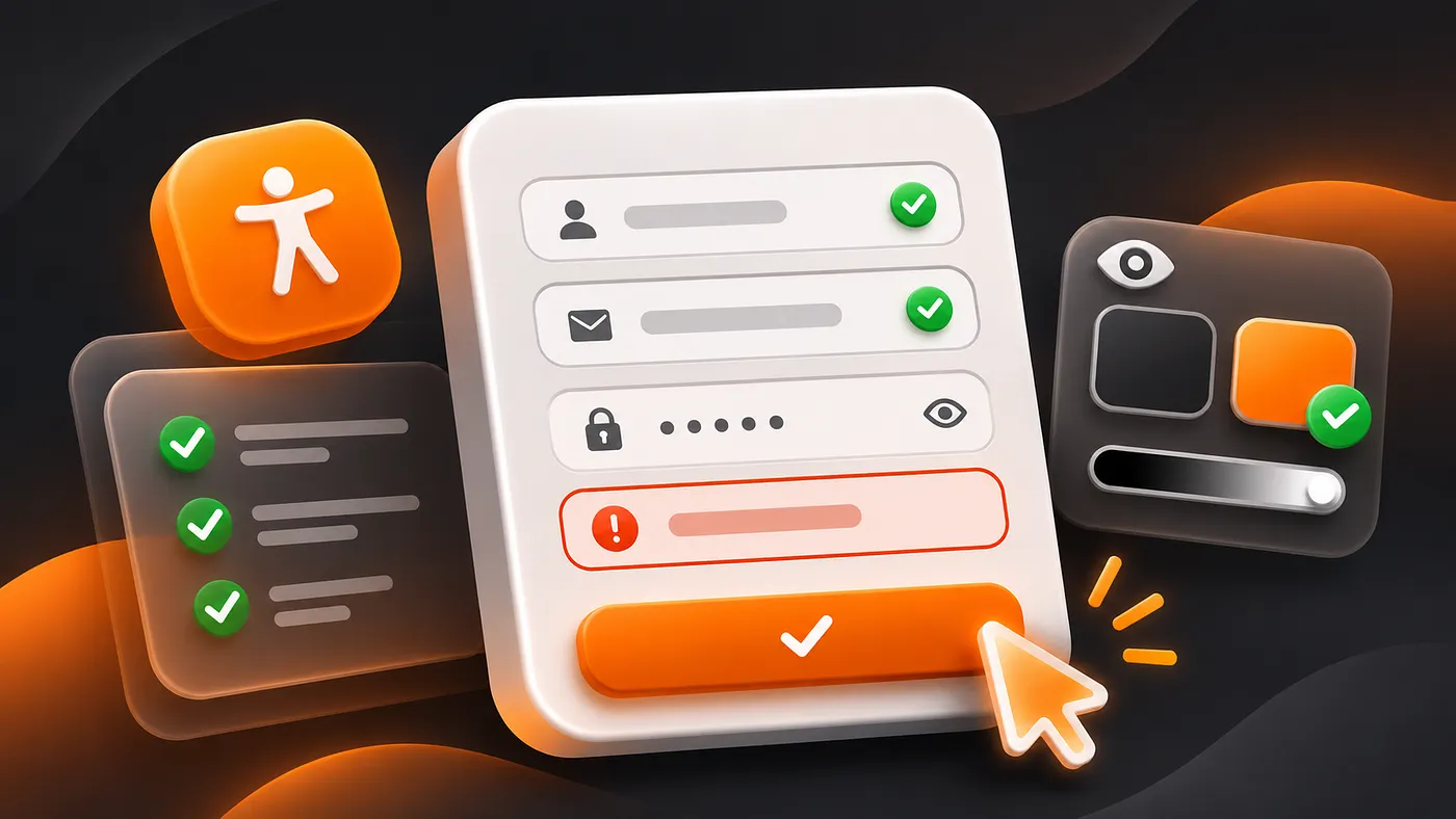
A placeholder is not a label. It disappears when you type, and it is an unreliable label for assistive technology. Yet AI loves the clean look of a form with placeholders only. The WebAIM scan found missing form labels on 51% of home pages.
The fix is a visible label above the field, linked with for and id. Add the autocomplete attribute too. It lets browsers and password managers fill fields, and it helps people who find typing hard. WCAG calls this identifying input purpose, and it is level AA.
Paste this into your AI tool:
Audit every form in this project.
For each input, select and textarea:
1. A visible label above the field, linked with for and id. No placeholder-only fields.
2. The correct type: email, tel, url, number, password.
3. The correct autocomplete value: name, email, tel, street-address, postal-code, current-password, new-password, one-time-code.
4. Input text 16px or larger, so iPhone Safari does not zoom on focus.
One column. Group related fields with fieldset and legend.
List each field you changed.Check it: click any label. The cursor should jump into the field. If it does not, the label is not linked.
Fix 6: Write Errors That Help
A red border and the words “Invalid input” is not an error message. It tells nobody what is wrong, and it fails anyone who cannot see red.
A good error does three things. It says what happened. It says how to fix it. And it is connected to the field in code, so a screen reader reads it.
Before and after, as plain examples:
- “Invalid email” becomes “Enter an email like [email protected]”
- “Error” becomes “Couldn’t save. Check your connection and try again.”
- “Password too weak” becomes “Use at least 12 characters. A short sentence works well.”
Paste this into your AI tool:
Rewrite the form validation in this project.
- Validate when the user leaves a field, and again on submit. Not on every keystroke.
- Show the error as text under the field, with an icon. Never color alone.
- Link it with aria-describedby and set aria-invalid="true" on the input.
- On submit with errors, move focus to the first invalid field and announce a summary: "2 fields need your attention."
- Error text says what happened and how to fix it. No blame, no jargon.
- Keep what the user typed. Never clear the form on error.Gem: keeping what the user typed matters more than it sounds. WCAG 3.3.7, Redundant Entry, level A, says do not make people enter the same information twice in one process.
Check it: submit your form empty. Using only the keyboard, can you tell what is wrong and reach the first broken field in one move?
Fix 7: Stop Blocking Passwords
AI sometimes adds onPaste handlers that block paste in password fields, or custom keyboards that fight password managers.
WCAG 2.2 added 3.3.8, Accessible Authentication, level AA. In plain words: do not make people pass a memory or puzzle test to log in unless there is another way. Allowing paste and password managers is the simplest way to meet it. Offering a magic link or passkey is another.
Use these in your login form:
<label for="email">Email</label>
<input id="email" name="email" type="email" autocomplete="username" />

<label for="password">Password</label>
<input id="password" name="password" type="password" autocomplete="current-password" />Exception: this is about the login step itself. Security checks that need a real puzzle are a separate question. If you use a CAPTCHA, offer an alternative.
Check it: log in using only your password manager. If you have to type anything by hand, fix it.
Part 3: Color, Size and Zoom
Fix 8: Check Contrast Where AI Cheats
AI loves light grey on white. It also loves grey placeholder text, pale borders and a brand color on a brand-tinted background.
The numbers, from WCAG 2.2:
- Normal text: at least 4.5:1 (criterion 1.4.3).
- Large text: at least 3:1. That means about 24px regular or about 19px bold, roughly.
- Icons, input borders, focus rings and other parts needed to understand a control: at least 3:1 against what they sit on (criterion 1.4.11).
The WebAIM scan found low contrast text on 83.9% of home pages in February 2026. It is the most common failure on the web. And it is the easiest to fix.
Where AI usually fails:
- Placeholder text
- Muted “secondary” text
- Text on a colored button or badge
- A light input border on a white page
- Disabled-looking states that are actually clickable
Exception: text on a disabled control is exempt, and so is pure decoration. A control that looks disabled but works is not exempt.
Paste this into your AI tool:
Audit color contrast across the project.
List every text and background pair, with the exact hex values and the ratio.
Flag anything below 4.5:1 for text, or below 3:1 for large text, icons, input borders and focus rings.
For each failure, give me the nearest hex value that passes, keeping the hue.
Update the design tokens, not individual components.
Never use color alone for status. Pair every status color with an icon or a word.Check it: open the WebAIM Contrast Checker, or the color picker in Chrome DevTools, and test your three most-used text colors. It takes two minutes.
Fix 9: Make Targets Easy to Hit
WCAG 2.2 added 2.5.8, Target Size (Minimum), level AA. The size of a pointer target must be at least 24 by 24 CSS pixels, unless there is enough space around it. The spacing exception works like this: imagine a 24 pixel circle centered on each small target. The circles must not overlap another target.
Twenty four pixels is the floor, not the goal. On touch screens, aim for 44px, which is what major platform guidelines suggest. Two small icon buttons packed side by side are the usual offender.
There are exceptions: links inside a sentence do not need to be 24px tall, and a control is fine if an equivalent bigger one exists on the page.
/* Minimum comfortable target for buttons, icon buttons and inputs */
button,
[role="button"],
input[type="checkbox"] + label,
input[type="radio"] + label {
  min-height: 44px;
  min-width: 44px;
}
/* Space between neighbouring icon buttons */
.icon-button-group {
  display: flex;
  gap: 8px;
}Check it: use your thumb on a real phone. Tap the smallest button on the screen ten times. If you miss twice, so will your users.
Fix 10: Let People Zoom
Two AI habits hurt here. One is a viewport tag with user-scalable=no. The other is a layout that breaks when text gets bigger.
WCAG criterion 1.4.10, Reflow, says content should work without scrolling in two directions at a width equivalent to 320 CSS pixels. In practice that means a layout that works on a small phone and at 400% zoom on a desktop.
Use this viewport tag, and never block zoom:
<meta name="viewport" content="width=device-width, initial-scale=1" />And use relative units for text:
html { font-size: 100%; }
body { font-size: 1rem; line-height: 1.5; }Exception: data tables, maps and some complex tools are allowed to scroll sideways. Keep that scroll inside the table, not on the whole page.
Check it: press Ctrl and plus until you reach 400%, or set your browser width to 320px. Can you still read and use everything without scrolling sideways?
Part 4: Motion and Meaning
Fix 11: Respect Reduced Motion
Parallax, big slide-ins and auto-playing loops can make some people feel sick. Every major browser lets users turn motion down in their system settings. Your CSS can listen.
@media (prefers-reduced-motion: reduce) {
  *,
  *::before,
  *::after {
    animation-duration: 0.01ms !important;
    animation-iteration-count: 1 !important;
    transition-duration: 0.01ms !important;
    scroll-behavior: auto !important;
  }
}Gem: this is a safe default, not a design. For important animations, like a loading bar, swap motion for a still change, such as a color or text update.
Check it: turn on Reduce Motion in your system settings, reload, and use your app. Nothing should slide, spin or bounce.
Fix 12: Name Every Icon and Image
AI generates icon-only buttons all day. A screen reader reads them as “button” with no name. The WebAIM scan found empty links on 46.3% of home pages. Empty buttons were also common.
Two rules cover most of it:
- An icon-only button gets an accessible name that says the action, like aria-label=”Delete invoice”.
- An image gets alt text if it carries meaning, and alt=”” if it is decoration.
Good alt text says what the image is for, not what it looks like. For a chart, say the finding. For a logo that links home, say “Acme, home”.
Find every button, link and image in the project.
1. Icon-only buttons and links: add aria-label with the action, verb plus object. "Delete invoice", not "Trash".
2. Meaningful images: write alt text that says what the image tells the user.
3. Decorative images and icons next to a text label: alt="" or aria-hidden="true".
4. Never write "image of" or "icon of" in alt text.
List every change.Check it: use your browser’s accessibility tree or a screen reader and visit your main screen. Every control should have a name that makes sense on its own.
One Screen, Fixed: A Worked Example
This is an illustrative example, not real data. Say your AI tool generated a sign-up form like this:
<div class="form">
  <input placeholder="Email" />
  <input placeholder="Password" />
  <div class="btn" onclick="submit()">Submit</div>
  <p style="color:red">Invalid input</p>
</div>Five problems, mapped to the fixes above: no labels (Fix 5), no autocomplete (Fix 5), a div as a button (Fix 1), a vague error shown by color alone (Fix 6), and a label of “Submit” that says nothing about what happens.
After:
<form novalidate>
  <label for="email">Email</label>
  <input id="email" name="email" type="email" autocomplete="email"
         aria-describedby="email-error" aria-invalid="true" />
  <p id="email-error">Enter an email like [email protected]</p>

  <label for="password">Password</label>
  <input id="password" name="password" type="password" autocomplete="new-password" />
  <button type="submit">Create account</button>
</form>In a real build, the error shows only after validation, with an icon next to it, and aria-invalid is set when something is wrong. The button label is verb plus object. Everything is reachable with Tab, and the CSS from Fix 2 shows where you are.
Your 10-Minute Accessibility Check
You can run this before every release.
- Unplug the mouse. Tab through the main flow. Can you finish it?
- Zoom to 400 percent. Does anything vanish or overlap?
- Turn on Reduce Motion. Does anything still move?
- Run Lighthouse in Chrome DevTools and axe DevTools or WAVE on your three main screens.
- Check your three most-used text colors in a contrast checker.
- Turn on a screen reader for one minute. Is every button named?
One honest limit: automated tools only find part of the problems. They cannot tell you if your error message makes sense or if your focus order feels logical. Use them for the basics, then do the keyboard and zoom checks by hand.
Paste this as a final pass before you ship:
Act as an accessibility reviewer. Review the screens I describe or attach against ACCESSIBILITY.md and WCAG 2.2 AA.
Give me:
1. The 5 most serious problems for a keyboard-only user, with file and line.
2. The 5 most serious problems for a screen reader user.
3. The exact fix for each, with real values and code.
4. Anything you could not verify without running the app, so I can test it by hand.
Do not claim the app is accessible. Say what you checked and what you did not.Gem: the last line is there for a reason. AI will happily say “your app is fully accessible”. It cannot know that. Make it say what it checked.
What This Does Not Cover
This is a practical starter set, not a full audit and not legal advice. WCAG 2.2 AA has more criteria than these 12. If you serve regulated markets, public bodies or large customers, hire a specialist to test with real assistive technology. Disabled users are the best testers you can find, so ask them.
The Other Half: How It Looks
Accessibility is one half of an app that feels finished. The other half is how it looks. A form can pass every check above and still look like every other AI-built product.
I covered the visual side in my story AI Slop UI. If you want the same idea as one set you can drop into a project, I turned it into a short book: 27 Copy-Paste Prompts to Fix AI Slop UI.
It is 27 steps with one prompt per step. It starts with 8 tells that give away an AI-built interface, then 6 prompting habits, then 11 fixes for color, type, spacing, hero, cards, icons, copy, states, proof and mobile. It ends with a DESIGN.md rules file and a rating loop. You also get DESIGN.md, SCORECARD.md and PROMPTS.md as plain files. It works with Claude, Lovable, v0, Codex, Cursor and Bolt.
You do not need it to use anything in this story. Everything above is yours to copy.
The Truth
AI did not make your app inaccessible. It copied the average web.
And the average web fails the basics.
So write the rules once. Make the AI show its work. Then check it with your own hands.
It costs you an afternoon. It opens your product to more people.
Sources I Opened
- W3C: Understanding SC 2.5.8 Target Size (Minimum) (opens in a new tab)
- W3C: Understanding SC 2.4.11 Focus Not Obscured (Minimum) (opens in a new tab)
- W3C: Understanding SC 1.4.3 Contrast (Minimum) (opens in a new tab)
- W3C: Understanding SC 1.4.11 Non-text Contrast (opens in a new tab)
- W3C: Understanding SC 1.4.10 Reflow (opens in a new tab)
- W3C: Understanding SC 3.3.8 Accessible Authentication (Minimum) (opens in a new tab)
- W3C: Understanding SC 3.3.7 Redundant Entry (opens in a new tab)
- WebAIM Million 2026 report (opens in a new tab)
- European Commission: European Accessibility Act (opens in a new tab)
Want all 27 prompts?
The book has the full system: 27 copy-paste prompts, the DESIGN.md rules file and a private video of me fixing a real AI-built page.
