
A hero with one job
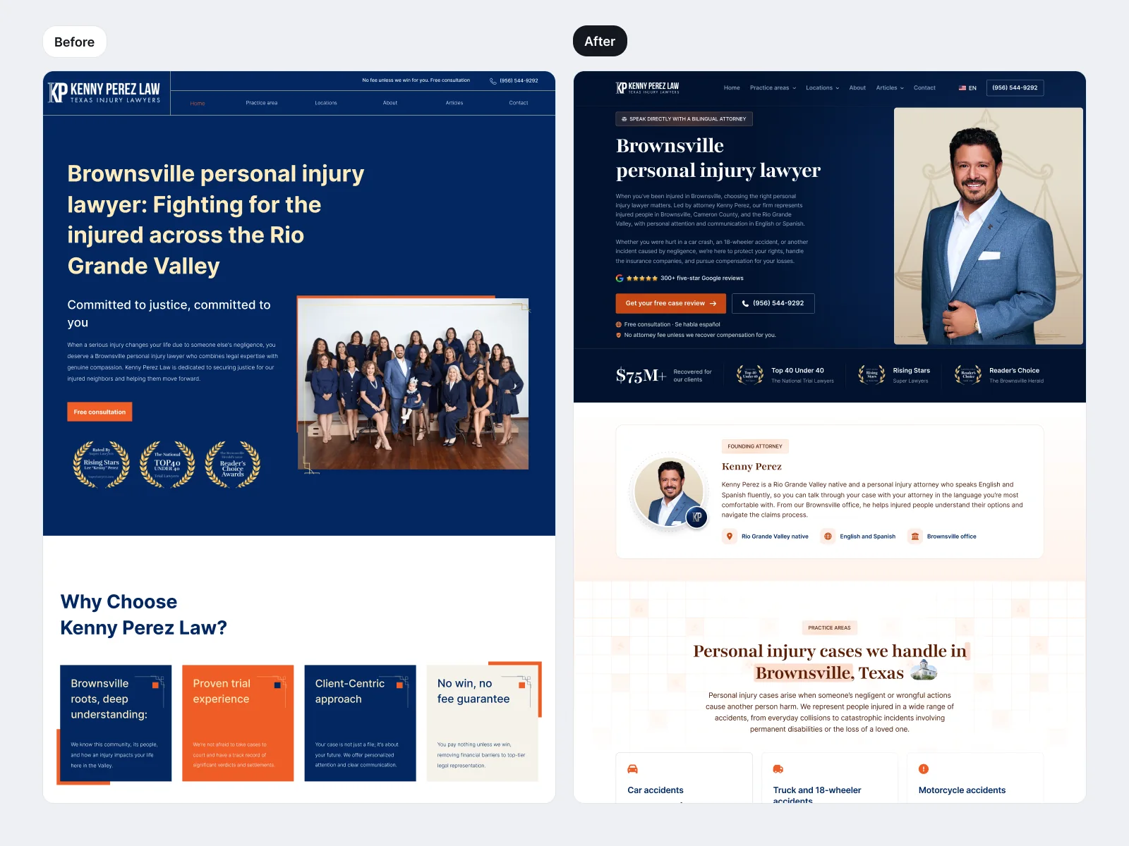
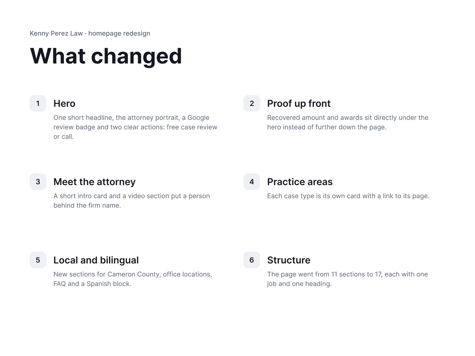
One short headline, the attorney portrait, a review badge and two actions: a free case review or a call.
Case study
Homepage redesign for a personal injury law firm in Texas
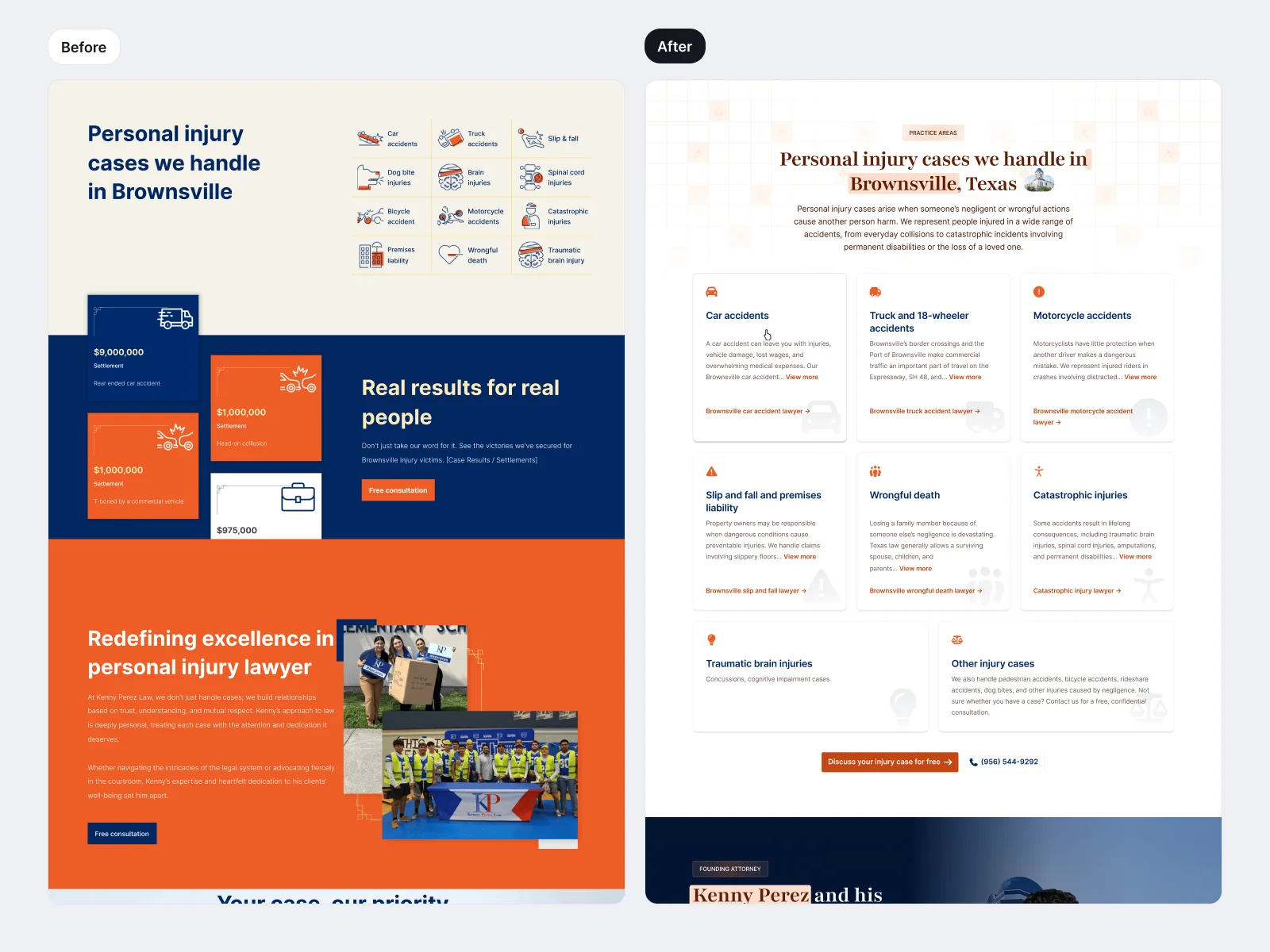
A homepage redesign for a personal injury firm in Brownsville, Texas. The old page opened with a long headline and a group photo. The new one leads with a short headline, the attorney, Google reviews and two clear ways to get in touch, then follows with an attorney intro, practice areas and local content. The video shows the old hero wiping to the new one.
One short headline, the attorney portrait, a review badge and two actions: a free case review or a call.
The amount recovered and the awards sit directly under the hero.
The page went from 11 sections to 17, each with a single purpose, including practice area cards, office locations, an FAQ and a Spanish block.
Available for new projects
No pitch. Just you, me and your product.
Not a fan of calendars? Me neither. Just say hi.


