
AI Slop UI: Why Your Claude, Cursor and Lovable Apps All Look the Same, and the 25 UX Fixes That Make Them Look Designed
Claude Code, Cursor, Lovable and v0 can ship a screen in 30 seconds. These are the 25 decisions that make it look like a person chose every pixel.

Your AI app works. So why does it still feel like a template?
You’ve seen it.
Purple gradient. Rounded cards. A hero that says “Supercharge your workflow.” Three feature boxes with icons. Done.
Open ten AI-built apps and you’ll think one person made all of them.
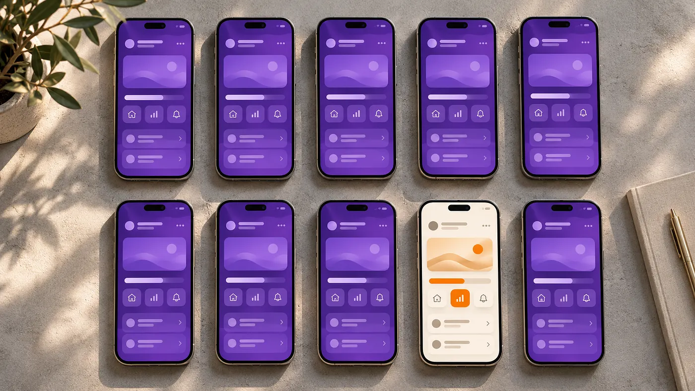
The problem usually starts before the code. You gave vague instructions, so you got unclear hierarchy and missing states. The result has a name: AI slop. It’s fast, but it’s fast at the average. Average design is invisible. Invisible products don’t get remembered, shared or paid for.
Here’s the good news. The gap between “AI made this” and “someone cared about this” is small. It’s 25 decisions. I’ve been making them on client work for over ten years, and you can work through them in a weekend.
Let’s go.
What AI Slop UI Actually Is
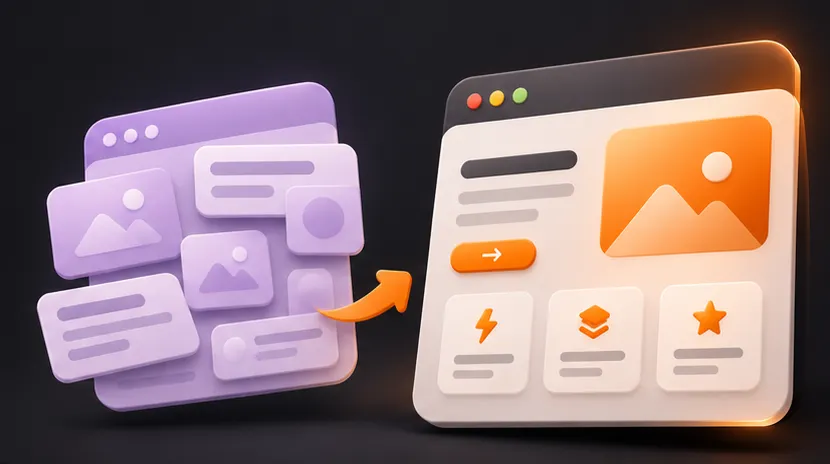
AI predicts the most likely interface. The most likely interface is the most common one. So you get the average of every SaaS landing page ever made.
You’re not fighting a bug. You’re fighting the average.
So your job changes. You stop asking the AI to “make it look good.” You give it decisions it could never guess.
Here are the 25 that matter most. If you only have 20 minutes, start with Fixes 1, 3, 6 and 25. They change the most for the least effort. Each fix also names the UX law behind it, so you know why it works, not just what to do.
Save this checklist. Each fix is explained below.
THE 25-FIX CHECKLIST
☐ 1  Neutral base, one brand accent, fixed status colors
☐ 2  One or two font families, 2 to 3 weights, body 16px+
☐ 3  Spacing only from 4, 8, 16, 24, 32, 48, 64
☐ 4  No cards inside cards, badges only for real status
☐ 5  Hero says outcome + who + how fast, over a real screenshot
☐ 6  Empty, loading, error, success and 404 states designed
☐ 7  Tested with long names, zero values and 3,000 rows
☐ 8  One border color, one radius system, soft shadows
☐ 9  12-column grid, content 1200px max, text 680px max
☐ 10 Optical details checked at 50 percent zoom
☐ 11 One filled primary button per task
☐ 12 Buttons have hover, pressed, focus, disabled, loading
☐ 13 Text contrast 4.5 to 1+, status never shown by color alone
☐ 14 One icon set, one stroke weight, icons have labels
☐ 15 Labels above fields, input text 16px+
☐ 16 Numbers right-aligned with tabular figures
☐ 17 5 to 7 nav items, named the way users talk
☐ 18 Motion 150 to 250ms, only for real events
☐ 19 Dark mode designed with tokens, not inverted
☐ 20 Tap targets 44px+, main action within thumb reach
☐ 21 Skeletons for predictable layouts, spinners for short actions
☐ 22 No long tour, sample data on the first screen
☐ 23 Real screenshots and photos, no AI blobs
☐ 24 Passes the squint test and the 5-second test
☐ 25 Buttons are verb + object, errors say how to fixPart 1: Foundations
Fix 1: Give Every Color a Job
A screen can have five colors and feel organized, or two and feel confusing. What matters is whether each color helps people see what they can do, what is selected and what needs attention.
UX law: Von Restorff effect. The one element that looks different is the one people notice and remember. Keep the accent scarce so it points to the right thing.
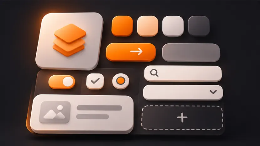
Every color in a UI has a type, and each type has one job:
- Neutrals: backgrounds, surfaces, text and borders. They cover most of the screen and carry the structure.
- Brand (primary) color: main actions, links and selected states. Use it sparingly so it stays visible.
- Secondary accent, optional: highlights, illustrations or tags. It supports the brand color and never competes with it.
- Semantic (status) colors: success, warning, error and info. Their meaning is fixed, so never use them as decoration.
- Data colors: a separate chart palette, different in both hue and lightness so series are easy to tell apart.
A useful starting split is 60/30/10: about 60 percent background, 30 percent surfaces and borders, and 10 percent or less for the brand accent and status colors together. Treat it as a starting point, not a law.
Build hierarchy, not a color quota.
If your main button, cards, badges and icons all demand attention, nothing stands out. Quiet the supporting elements until the main action leads.
Use color consistently.
Same meaning, same color. A selected tab, a link and a primary button can share the accent. An error gets its own color. Charts can use several colors, as long as they help people tell the data apart.
Use color psychology to choose, UX rules to place.
Colors carry associations. Blue often reads as calm and reliable, which is why so many finance and health products use it. Green suggests growth, money or success. Red signals urgency, so it’s the default for errors and destructive actions. Orange and yellow feel energetic and catch the eye. Purple often reads as creative or premium, and near-black neutrals feel serious and high-end.
These associations shift with culture, industry and audience, and they never beat contrast or clear meaning. If your brand color is red, people may read every button as a warning, so lean on labels and icons. Pick the brand color with psychology. Decide where it goes with UX rules.
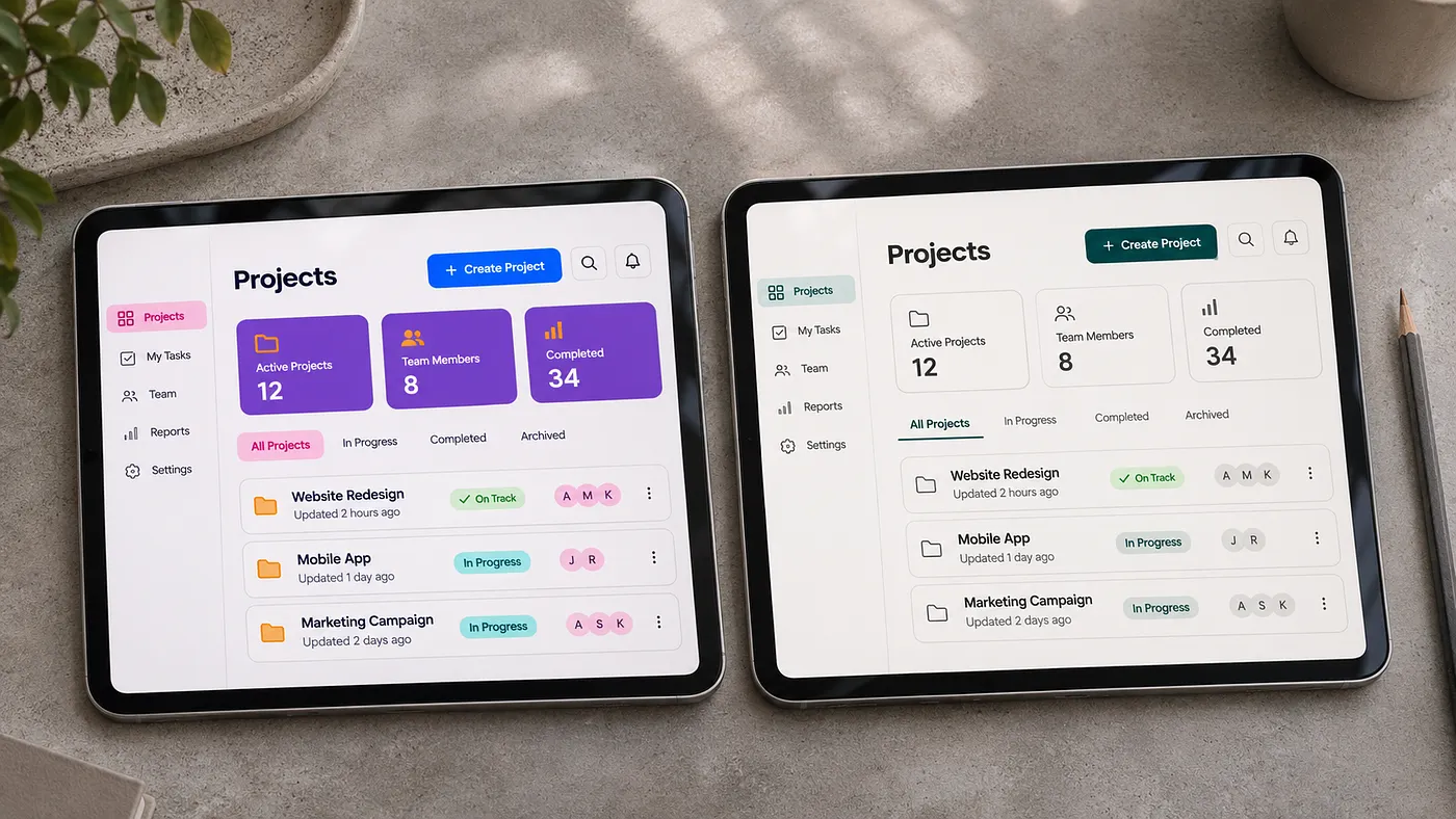
Try this: open your busiest screen and say what each color means. If a color has no job, remove it.
Here is the structure. The colors are yours. Write it down once and put it in your DESIGN.md (Step 1 below), so you never paste it again.
COLOR SYSTEM (fill in your own brand)
Background: the page itself, your lightest neutral
Surface: cards and panels, one step off the background
Text: near black, never pure black
Muted text: secondary info, still at least 4.5 to 1 contrast
Border: low contrast, one value everywhere
Brand accent: your brand color, for primary actions, links and selected states
Secondary accent: optional, for highlights, never competing with the brand accent
Status: success, warning, error and info, each paired with an icon or a word
Data: a separate chart palette so series are easy to tell apartThe goal is a screen where people can tell what matters, what happened, and what to do next.
Fix 2: Use One or Two Font Families, Never More
Most AI screens use three font families, five sizes and four weights, and they all look almost the same.
UX law: Law of Similarity. Text that looks the same is read as the same role. Two families at most and clear size steps keep headings, body and labels distinct.
Use one font family, or two at most: one for headings and one for body text. A third family makes the screen look unplanned. Stick to two or three weights, like regular, medium and semibold, and make the jump between a heading and body text big enough to see from across the room.
- Body text: 16px minimum
- Body line height: 1.5
- Headings: line height 1.1 to 1.2
- Large headings: tighten the letter spacing by 1 to 2 percent
Tip: contrast in size creates hierarchy. If your heading and body are close in size, no amount of color will fix it.
Fix 3: Use a Spacing Scale, Never Random Numbers
Look at AI output. 13px here. 18px there. 22px somewhere else.
UX law: Law of Proximity. Things that sit close together are seen as one group.
Pick a scale and stay on it: 4, 8, 16, 24, 32, 48, 64.
Then apply one rule. The space between groups must be bigger than the space inside groups. That’s it. That’s what makes a layout feel organized.
Tip: when a screen feels cheap, check grouping, density and available space first. More padding often fixes it, but not always.
Every size, gap and padding is a multiple of 4. Small exceptions are fine, like a 1px border or a 1 to 2px nudge so an icon looks centered.
Here is the scale, and what each step is for:
SPACING SCALE (4pt grid, every value is a multiple of 4)
4px   space-4  icon to its label, tight pairs
8px   space-8  related items: label to field, title to subtitle
16px  space-16  default padding inside buttons, inputs and cards
24px  space-24  gap between cards or form groups
32px  space-32  gap between sections inside a screen
48px  space-48  space above a section heading
64px space-64 space between major page sectionsThings that belong together sit 8px apart. Separate groups sit 24px or more apart. If both gaps are the same, the screen reads as one flat list.
Fix 4: Fewer Cards
AI puts everything in a box. Then puts a box in the box.
UX law: Law of Common Region. A border or background groups whatever is inside it, so every extra box is another group to read.
A card inside a card is a red flag. Use white space, a divider or a heading to separate things instead.
Boxes are for things the user acts on. Everything else can just sit on the page.
Tip: the same goes for badges. A pill on top of every card, heading and feature (New, Pro, AI-powered) makes a screen feel generated. Use a badge only when it carries real status, like Paid or Overdue.

Part 2: Content and States
Fix 5: Replace the Generic Hero with Proof
“Supercharge your workflow” says nothing. Nobody has ever read that and understood what the product does.
UX law: Serial Position effect. People remember the first and last things best, so your first line has to carry the message.
Use this formula instead: outcome + who it’s for + how fast.
Bad: “The all-in-one platform for modern teams.” Better: “Send invoices in 30 seconds. Built for freelancers.”
Then show the real product under it. A real screenshot proves the product works. Use a diagram or illustration when it explains something a screenshot can’t.
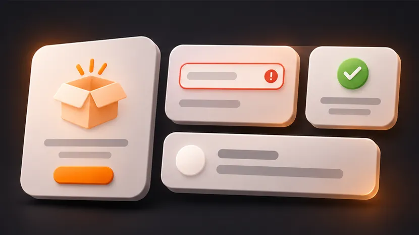
Fix 6: Design the States AI Skips
AI builds the happy path. The one where data exists, the network works and nothing breaks.
UX law: Tesler’s Law. Complexity can’t be removed, only moved. If the design skips the hard states, the user ends up handling them.
Real users live in the other four:
- Empty: nothing here yet
- Loading: something is coming
- Error: something broke
- Success: it worked, and the screen says so
The empty state is the first screen every new user sees. Make it tell them what to do next, not show blank charts.
Don’t forget the 404 page. Say what happened, offer search or your main links, and add one button home. Never leave a dead end.
Fix 7: Test with Ugly, Real Data
AI designs with “John Doe” and perfect round numbers. Your users have a customer named “Alexandra Papadopoulou-Richardson” and a total of $1,847.33.
UX law: Postel’s Law. Be liberal in what you accept. Design for the messy data people really have.
Before you ship, try these:
- A name with 60 characters
- A list with 1 item and a list with 3,000
- A value of zero
- A chart with one data point
If the layout breaks, fix it now. Your users will find it in the first week.
Part 3: Consistency and Polish
Fix 8: Make Borders, Shadows and Corners Consistent
Pick one border color at low contrast and use it everywhere. Pick a small radius system, like 8px for small elements and 12px for cards and panels, and stay inside it. Keep shadows soft, wide and faint.
UX law: Law of Similarity. Elements that look alike feel related. One border, one radius system and one shadow style make every screen feel like one product.
Most “cheap” interfaces aren’t missing anything. They’re inconsistent. Five different radii on one screen reads as no one being in charge.
Tip: skip decorative glows and colored strokes. Keep edges neutral, and use shadows only when they do a job.
Fix 9: Align Everything to a Grid
Misalign something by 2 pixels and the whole screen feels off, even if nobody can say why.
UX law: Law of Prägnanz. People read ordered, simple layouts with less effort.
Use a 12-column grid for layout and snap everything to it. Left edges line up. Text baselines line up. Cards in a row share the same height.
Tip: AI loves centered text inside left-aligned layouts. Pick one alignment per section and stay there. Left-aligned text is easier to read almost every time.
Tip: set a layout max width. Keep content around 1200px and centered, and reading text around 680px. AI stretches everything edge to edge on a wide monitor, and it looks cheap.
Fix 10: Fix the Optical Details
Math and looking right are not the same thing. A circle the same size as a square looks smaller, so make it slightly bigger. An icon next to a label should sit on the text’s center line, not the box’s.
UX law: Aesthetic-Usability effect. People see polished interfaces as easier to use and forgive small issues more.
Check your buttons. If the label looks centered but the icon pulls it to one side, nudge it 1 to 2 pixels. These small optical nudges, along with 1px borders, are the allowed exceptions to the grid.
Check it: zoom out to 50 percent. Whatever looks off at 50 percent will look off to everyone.
Part 4: Components and Accessibility
Fix 11: One Primary Button per Task
AI gives you five blue buttons. Users freeze.
UX law: Hick’s Law. The more choices people see, the longer they take to decide.
Use three levels:
- Primary: filled, once per task (usually once per screen)
- Secondary: outline or soft fill
- Tertiary: plain text link
Tip: if one task has two primary actions, you haven’t decided what the user is there to do. Go back to the user’s goal.
Tip: the label is part of the button. “Send invoice” beats “Submit” every time, because the user knows what will happen before they click. Fix 25 has the full UX copy rules.
Fix 12: Design Every Button State
A button has six common states: default, hover, pressed, focused, disabled and loading. Design all six.
UX law: Doherty Threshold. Feedback under 400ms keeps people engaged, so pressed and loading states must show instantly.
Keep a visible focus ring for keyboard users. Never remove the outline without replacing it with something better.
Tip: show the loading state inside the button and keep its width fixed, so the layout doesn’t jump. And if a button is disabled, tell the user why, or leave it enabled and explain the problem on click.
Check it: navigate the screen using only your keyboard. Can you reach every action, see where focus is, and recover from an error?
Fix 13: Check Contrast Before You Ship
Light grey on white looks elegant and is unreadable. Aim for at least 4.5 to 1 for body text, and 3 to 1 for large text, input borders and focus rings. That’s the WCAG AA standard, and your browser’s dev tools can check it in seconds.
UX rule: WCAG 2.2 AA. Low-contrast text is the most common accessibility error on the web, according to WebAIM’s yearly scan of the top million home pages.
Tip: never use color alone to show status. Add an icon or a word. Around 1 in 12 men have some form of color vision deficiency, so a red and green badge fails for them.
Fix 14: One Icon Set, One Stroke Weight
AI mixes filled icons with outline icons, thin strokes with thick ones, 18px with 22px.
UX law: Law of Similarity. Icons that share one style read as one family. Mixed sets read as mixed sources.
Pick one set (Lucide, Phosphor and Heroicons are all solid), one stroke weight and a small size scale like 16, 20 and 24.
Tip: pair icons with words unless the meaning is universal. Search, close and home are fine alone. Everything else needs a label. Even then, icon-only buttons need an accessible name for screen readers.
Fix 15: Fix Your Forms
Forms are where AI slop costs you money, because this is where people leave.
UX law: Miller’s Law. People hold only a few items in working memory, so break long forms into small groups.
- Labels go above fields. A placeholder is not a label, because it disappears when the user types.
- One column, with related fields grouped.
- Validate after the user leaves a field, not on every keystroke.
- Use the right input type so phones show the right keyboard.
Tip: set input text to at least 16px. Below that, iPhone Safari zooms the page in when someone taps the field.
Fix 16: Make Tables Easy to Scan
Right-align numbers and left-align text. Turn on tabular figures (font-variant-numeric: tabular-nums) so digits line up in a column. Keep rows 40 to 48px tall and the header sticky.
UX law: Selective Attention. People scan for what they need and skip the rest, so put the key column first and make numbers easy to compare.
Put the most important column first, and skip zebra stripes if thin dividers already do the job.
Tip: show one clear action on a row, not three icons on every row. If you reveal it on hover, reveal it on keyboard focus and on touch too, because a phone has no hover.
Fix 17: Keep Navigation Short and Honest
Start with 5 to 7 top-level items, then organize around real tasks. Use words, not only icons. Show where the user is with a filled state or bold label, and keep the navigation in the same place on every screen.
UX law: Jakob’s Law. Users expect navigation where other products put it. Familiar beats clever.
Tip: name things the way your users say them, not the way your database does. A clear label like “Team settings” beats a forced single word.
Part 5: Motion, Mobile and Speed
Fix 18: Use Motion to Explain, Not Decorate
Keep most UI transitions between 150 and 250 milliseconds. Use ease-out for things entering and ease-in for things leaving. Animate what changed so the eye can follow it: a deleted row collapses, a new item slides in.
UX law: Cognitive Load. Motion that shows what changed saves people from working it out.
Respect prefers-reduced-motion for people who get sick from movement.
Tip: if the animation draws attention to itself instead of to what changed, it’s too slow or too big.
Tip: animate real events, like a save that finished, never decoration. Keep hover quiet: a small contrast change, no lifting, tilting or glowing.
Fix 19: Design Dark Mode, Don’t Invert It
Inverting colors gives you harsh contrast and muddy accents. Use a dark grey background instead of pure black, off-white text instead of pure white, and slightly softer accent colors.
UX law: Mental Model. People expect dark mode to be the same product, just darker. Keep the same hierarchy and meaning.
In dark mode, raise elevation with lighter surfaces, not heavier shadows.
Tip: build with color tokens from day one (background, surface, text, accent). Then dark mode is a swap, not a rewrite.
Fix 20: Design for Thumbs First
Make tap targets at least 44px. Put the main action at the bottom of the screen where a thumb reaches. Leave at least 8px between tappable things so people don’t hit the wrong one.
UX law: Fitts’s Law. Bigger, closer targets are faster and easier to hit.
Check it: test on a real phone, in one hand, outdoors. The desktop preview lies to you.
Fix 21: Use Skeletons When the Layout Is Predictable
A spinner says “wait.” A skeleton shows the shape of what’s coming, so the page feels faster than it is.
UX law: Goal-Gradient effect. People keep going when they see progress, so show real progress on long tasks.
Use spinners only for short actions. For long tasks, show real progress. When an action will almost certainly work, like liking a post or ticking a checkbox, update the screen first and sync after.
Tip: never block the whole page because one widget is slow.
Fix 22: Cut the Onboarding Tour
Most people skip a long product tour. Ask one question, show one result and let them in.
UX law: Paradox of the Active User. People skip tutorials and start using the product right away, so teach in context.
Teach in context, at the moment the user needs it. And fill the product with sample data so the first screen isn’t a blank, dead app.
Tip: track time to first value. If it takes more than a few minutes, you have a design problem, not a user problem.
Part 6: Imagery, Testing and Copy
Fix 23: Use Real Imagery, Not AI Blobs
3D blobs, gradient orbs and generic stock illustrations scream template.
UX law: Aesthetic-Usability effect. Real, consistent images make a product look trustworthy. Generic art makes it look like a template.
Use real product screenshots, real photos of real people, a diagram that explains something a screenshot can’t, or nothing at all. Give every image the same crop, the same corner radius and the same treatment. Compress everything, because a fast page feels premium.
Tip: a well-cropped real screenshot with a soft shadow usually does more work than a custom illustration.
Fix 24: Run the Squint Test
Blur the screen in Figma by 10px, or squint. What do you see first? It should be the most important thing on the page. If it’s a gradient or a logo, fix the hierarchy.
UX law: Von Restorff effect. Blurring shows which element stands out. Make sure it’s the one that matters.
Then run the 5-second test. Show someone the screen for 5 seconds and ask what the product does and what they’d do next. If they can’t tell you, the screen failed.
Tip: do both before you show anything to a client. They catch what your eyes stopped seeing hours ago.
Check it: before anything ships, look at it the way a person will. Screenshot every screen on phone and desktop, in light and dark mode.
Fix 25: Write the UX Copy Like a Human
This is the one almost everybody skips, and it’s the highest return of all 25.
UX law: Cognitive Load. Every extra word costs attention. Clear copy makes the whole interface feel easier.
Words are part of the interface. Bad copy makes a good layout feel broken.
Here are the rules I follow:
- Say what happens. Buttons are a verb plus an object.
- Put the point first. Users read the first few words and move on.
- Cut every word that doesn’t help. Then cut one more.
- Talk like a person. If you wouldn’t say it out loud, don’t write it.
- Errors say what happened and how to fix it. No blame, no jargon.
- Empty states answer three things: what goes here, why it matters, what to do.
- One word per thing. Don’t call it a project in one place and a workspace in another.
Before and after:
- “Submit” becomes “Send invoice”
- “An error occurred. Please try again later.” becomes “Couldn’t save. Check your connection and try again.”
- “No data available” becomes “No invoices yet. Create your first one in 30 seconds.”
- “Are you sure you want to delete?” becomes “Delete this project? You can’t undo this.”
- “Welcome to the dashboard!” becomes “Here’s what needs you today.”
Check it: read your interface out loud. Anything that sounds like a robot wrote it, rewrite.
Three more rules for the whole product. Use plain words, with no sales talk like “unlock your potential” or “supercharge.” Use only real numbers, with no invented reviews, ratings or user counts. And never invent urgency or rewards to push people.
One Screen, Five Fixes: A Worked Example
Here is how the fixes stack on a typical AI first draft of an invoice dashboard.
- Hierarchy: the draft shows six equal cards, so nothing leads. Make “Overdue invoices” the biggest element and push the rest down a level (Fixes 1 and 24).
- Spacing and grouping: put each invoice’s name, amount and date 8px apart, and leave 32px between invoice groups (Fix 3).
- One dominant action: make “Send reminder” the one filled button for the overdue group, and outline the rest (Fix 11).
- States: add an empty state (“No invoices yet. Create your first one in 30 seconds.”), a skeleton while loading, and an error that says how to fix it (Fixes 6, 21 and 25).
- Labels and data: replace “Submit” with “Send invoice” and test with a 60-character client name and a $0 total (Fixes 7 and 25).
For every change, ask three things: what changed, why it helps, and how can I check it. That repeatable check is worth more than any single rule.
No Single Prompt Removes Slop
There is no magic line like “make it less generic”. Slop goes away when you do three things.
- Rewrite. Say exactly what is wrong, with real values. “The cards feel cramped” becomes “Put 24px between cards and 16px padding inside them.”
- Explain. Say why. “This is a billing screen, so the overdue amount is the one thing people must see.” A reason lets the AI make the next decision correctly without you.
- Save it. Tell the AI to write the rule into DESIGN.md, the rules file you set up in Step 1 below, so the next chat starts with it. Copy this:
Save this decision to DESIGN.md under the right section, with today's date.
Write it as a short rule with exact values.
If it conflicts with an older rule, keep the newer one and tell me.
From now on, read DESIGN.md before you change any UI.Step 1: Save Your Rules So the AI Can Follow Them
Without shared rules, every new prompt starts from zero, so screen 12 drifts away from screen 3.
Fix it once, in files the AI reads every time:
- DESIGN.md: your design rules in one file. Color, spacing, motion, shadows, writing and process. Give every rule a date, and let the newest decision win.
- CLAUDE.md: the instructions Claude Code reads at the start of every session. Point it at DESIGN.md and tell it to check its own work. Using another tool? Codex and Cursor read AGENTS.md, and Cursor also has project rules. In Lovable, paste the same text into your project’s Knowledge.
- Figma first: design your key screens and base components in Figma before you build. Name your Figma variables the same as your CSS tokens, then give the AI the link or a screenshot as a reference. It builds from a picture, not from the average.
Start with this DESIGN.md. Swap the [brackets] for your own.
# DESIGN.md
Last updated: [date]. The newest dated decision wins. Write every change down.
## Color
- One brand accent: [hex], shared by primary actions, links and selected states. Status colors are separate.
- Neutrals: [background], [surface], [text], [muted text], [border].
- Mostly neutral surfaces. Color only where it helps people find the next step.
- No unintentional gradients. No decorative colored borders or glows.
## Spacing
- 4px base unit. Every margin, gap and padding comes from: 4, 8, 16, 24, 32, 48, 64. Exceptions: 1px borders and 1 to 2px optical nudges.
- Similar elements sit together, 8px apart. Separate groups sit 24px or more apart.
- Touch targets at least 44px.
- Content max width 1200px. Text max width 680px.
## Buttons
- One dominant action per task or decision. Make it the filled button. Everything else is outline or plain text.
- Labels are a verb plus an object.
## Motion
- Motion marks a real event, never decoration.
- Hover stays quiet: a small contrast change, no lift, tilt, zoom or glow.
- Respect prefers-reduced-motion. Every animation has a still version.
## Shadows
- Only when needed. Low opacity, large blur, small offset.
## Writing
- Plain words. No sales talk like "supercharge" or "unlock".
- Only real numbers. No invented reviews, ratings or user counts.
## Process
- Refine what exists. Keep the content. Do not delete sections.
- Check screenshots on phone and desktop, in light and dark, before shipping.Then add this to CLAUDE.md. The line about spacing shows the trick: tell the AI exactly which file and which section holds the system.
# CLAUDE.md
Before you change anything, identify what you will change and wait for my confirmation after each step.
Before you change any UI, read DESIGN.md and follow it.
Use the spacing system from DESIGN.md, section "Spacing". Do not invent new values.
If a request breaks a rule in DESIGN.md, stop and tell me, then propose a fix.
Reuse existing components and tokens. Do not invent new colors, radii or spacing.
After every UI change, check it on phone and desktop, in light and dark mode.
When I make a new design decision, add it to DESIGN.md with today's date.Rules reduce drift, but they don’t remove it. Keep checking the output against DESIGN.md, and your product stops looking like everyone else’s.
Steps 2 to 4: Build, Audit, Fix the Copy
Don’t tell an AI to “make it modern.” Give it a brief. Copy any box below into Cursor, Lovable, v0, ChatGPT or Claude, and swap the [brackets] for your own details.
Step 2: Build the Screen
Before you change anything, identify what you will change and wait for my confirmation after each step.
Read DESIGN.md and follow it.
Build this screen: [describe the screen and who uses it].
Include empty, loading, error and success states.
Use realistic data, including a 60-character name and a value of zero.
If my request breaks a rule in DESIGN.md, tell me and propose a fix.
Before you write code, list the design decisions you made and why.Step 3: Audit a Screen You Already Have
Act as a senior product designer. Review the screen I describe or attach below.
CHECK IT FOR
- accent color, neutrals and any gradient nobody chose on purpose
- type scale and spacing scale
- cards, badges and visual hierarchy
- consistent branding and layout max width
- empty, loading and error states, and the 404 page
- borders, radii and grid alignment
- button hierarchy, button states and button labels
- color contrast, forms, tables and navigation
- mobile tap targets and UX copy
GIVE ME
1. The 5 biggest problems, ranked by impact.
2. For each one, the exact change to make, with real values (px, hex, ms).
3. One thing that already works and should stay.
Be blunt. No praise padding.
[paste a screenshot or describe the screen]Step 4: Fix Your UX Copy, Buttons First
Rewrite the UX copy below. Start with the buttons.
RULES
- Buttons are a verb plus an object. Never "Submit", "OK" or "Click here".
- Put the point first.
- Cut every word that doesn't help.
- Talk like a person.
- Errors say what happened and how to fix it. No blame, no jargon.
- Empty states say what goes here, why it matters and what to do.
- One word per thing. Don't mix "project" and "workspace".
Give me 3 options for each line, shortest first, and tell me which one you'd ship.
[paste your button labels, errors and empty states]Do Step 1 once. Run Steps 2 to 4 on every new screen and the output changes completely.
Switch Models on Purpose, Then Go Back
Most of us pick one model and stay on it. It is quick, it is cheap and we know how it behaves. That is a sensible default.
But the model you use every day tends to give the safest answer, and the safest answer is often the slop. So do not be scared to switch. In Claude Code, Cursor or whatever tool you use, switch to a stronger model for the hard part: the first design pass, a layout that keeps coming out generic, or a rewrite of your rules. In my experience, this gives better results than pushing the same model harder with the same prompt.
Then go back to your base model. Once the decisions are written down, the cheaper model can follow them. You pay for the stronger model once, at the point where thinking matters most.
Tip: use the stronger model to write and tidy your DESIGN.md, then let your base model build from it.
One warning: a stronger model is not a guarantee. Check its output the same way you check any other.
Tools and Further Reading for the 25 Fixes
- Refactoring UI (opens in a new tab): a short paid book on visual design for developers, with free sample chapters
- Laws of UX (opens in a new tab): the psychology behind hierarchy, choice and speed
- WebAIM Contrast Checker (opens in a new tab): test Fix 13 in seconds
- Lucide (opens in a new tab) and Phosphor (opens in a new tab): consistent icon sets for Fix 14
- Nielsen Norman Group (opens in a new tab): research-backed articles on forms, navigation and onboarding

The Truth
AI didn’t kill design. It killed the average.
When anyone can generate a decent screen in seconds, “decent” stops being worth anything. The only thing left that people notice is whether someone made choices.
So make choices.
The 25 fixes above are the public version. The full system, with all 27 prompts ready to paste into Claude Code, Cursor or Lovable, is in my short book: 27 Copy-Paste Prompts to Fix AI Slop UI

Want all 27 prompts?
The book has the full system: 27 copy-paste prompts, the DESIGN.md rules file and a private video of me fixing a real AI-built page.
