One balance first
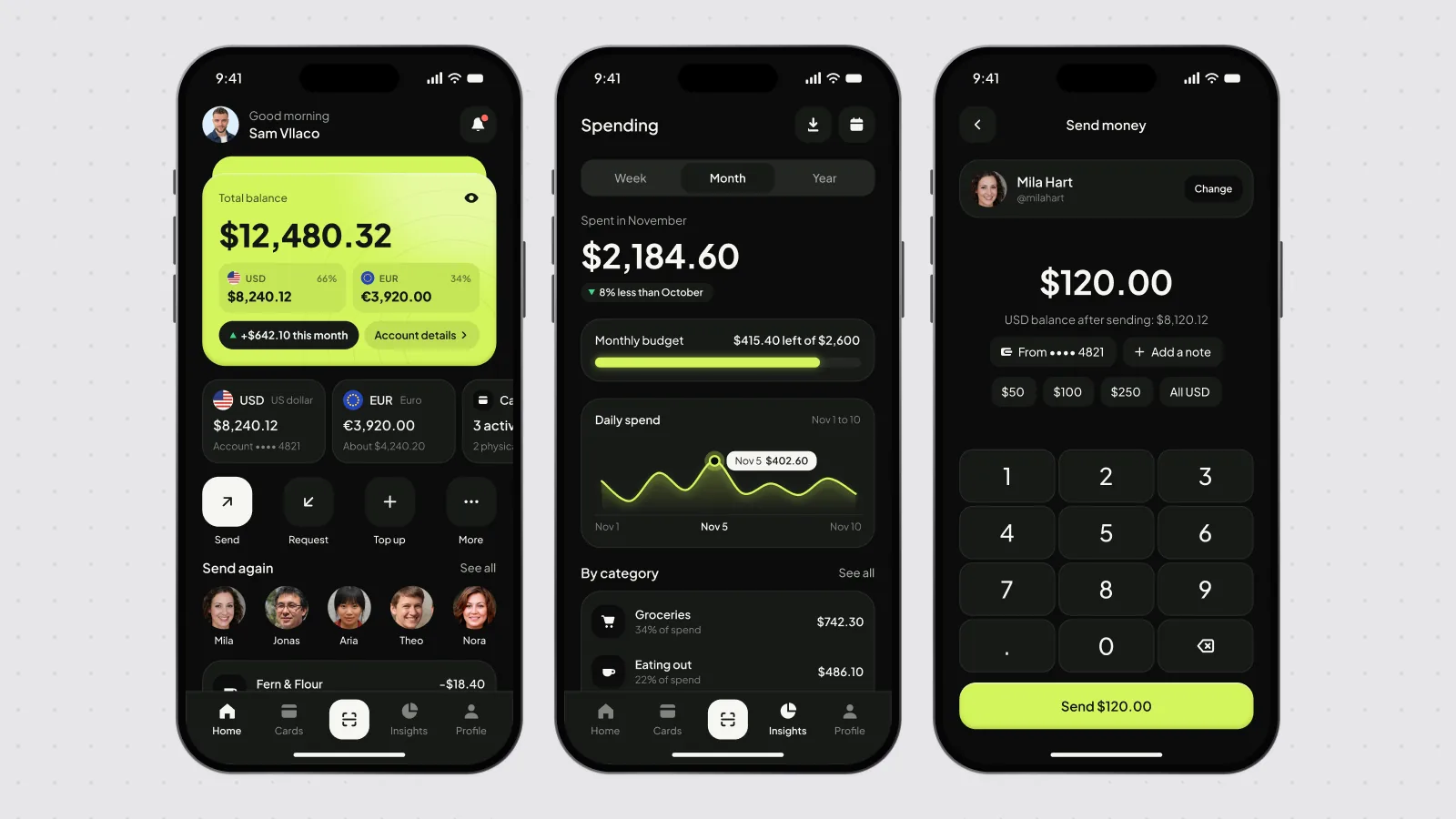
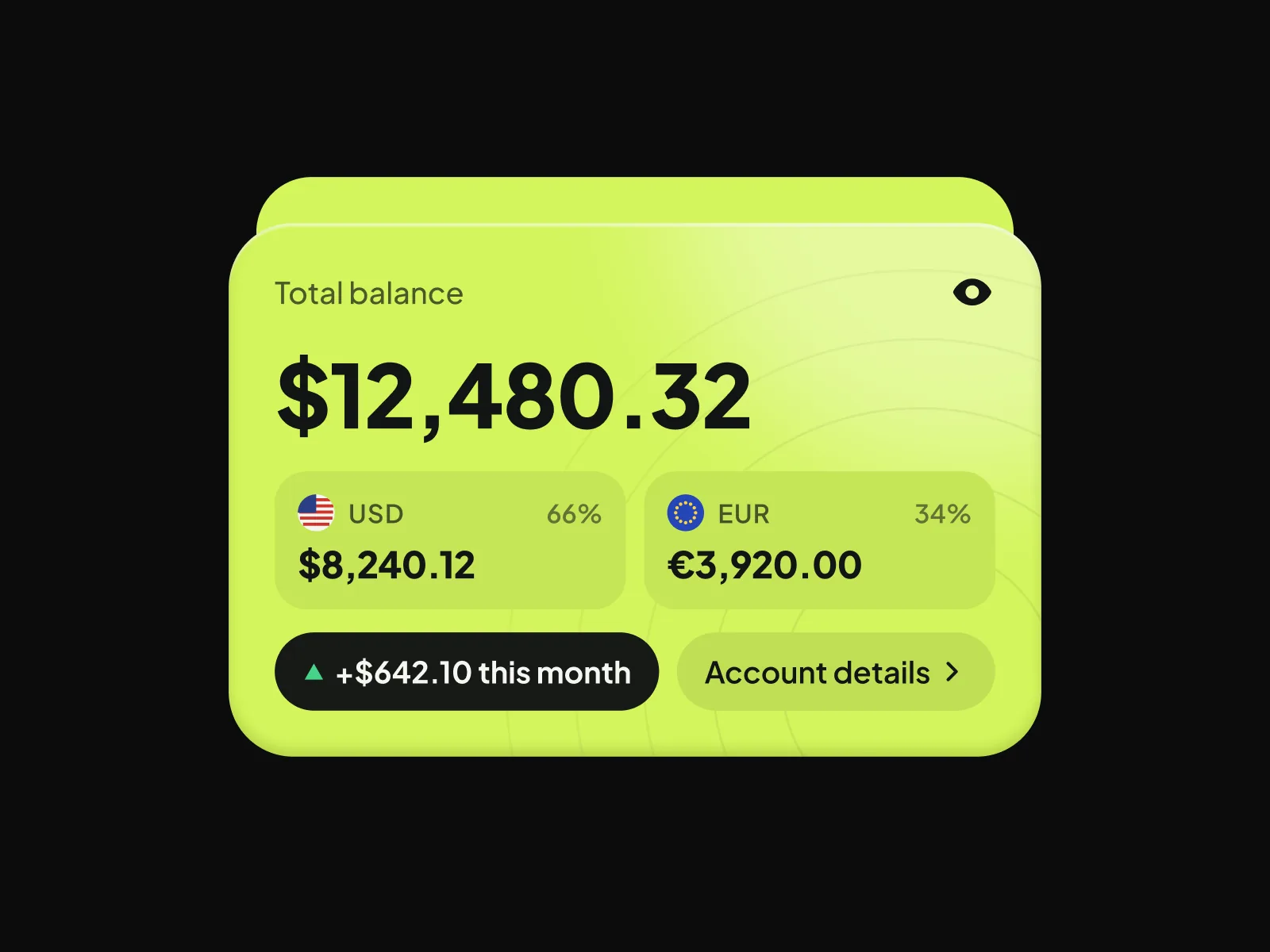
The total sits in the largest card, with each currency under it.
Case study
A dark banking app for balances, spending and sending money
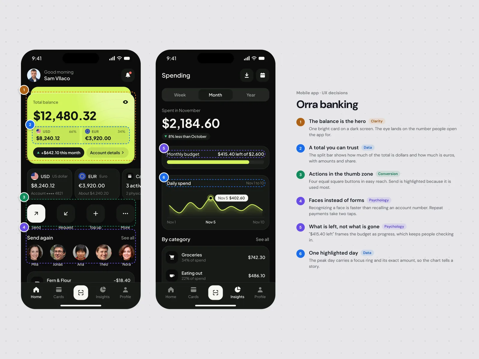
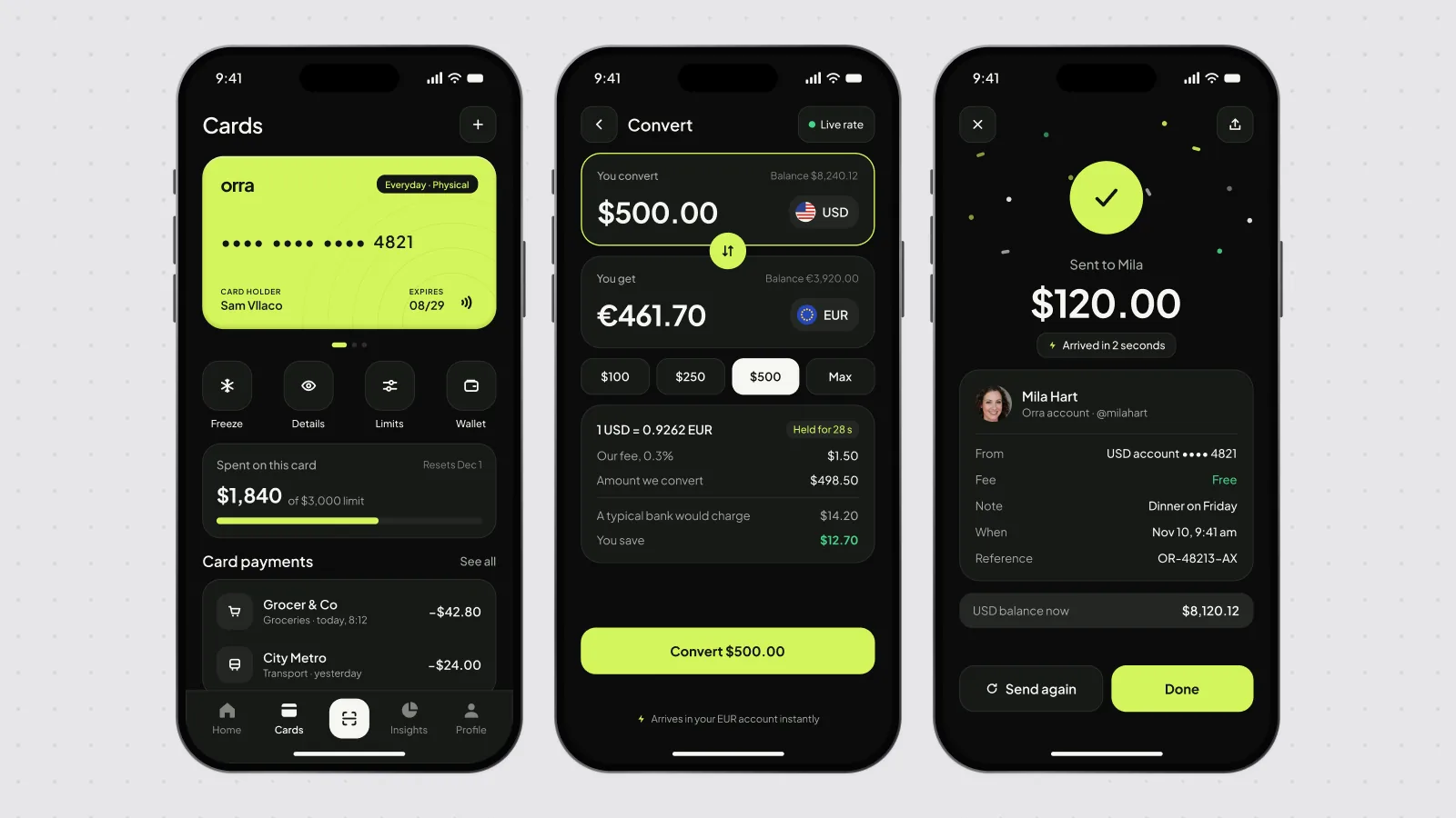
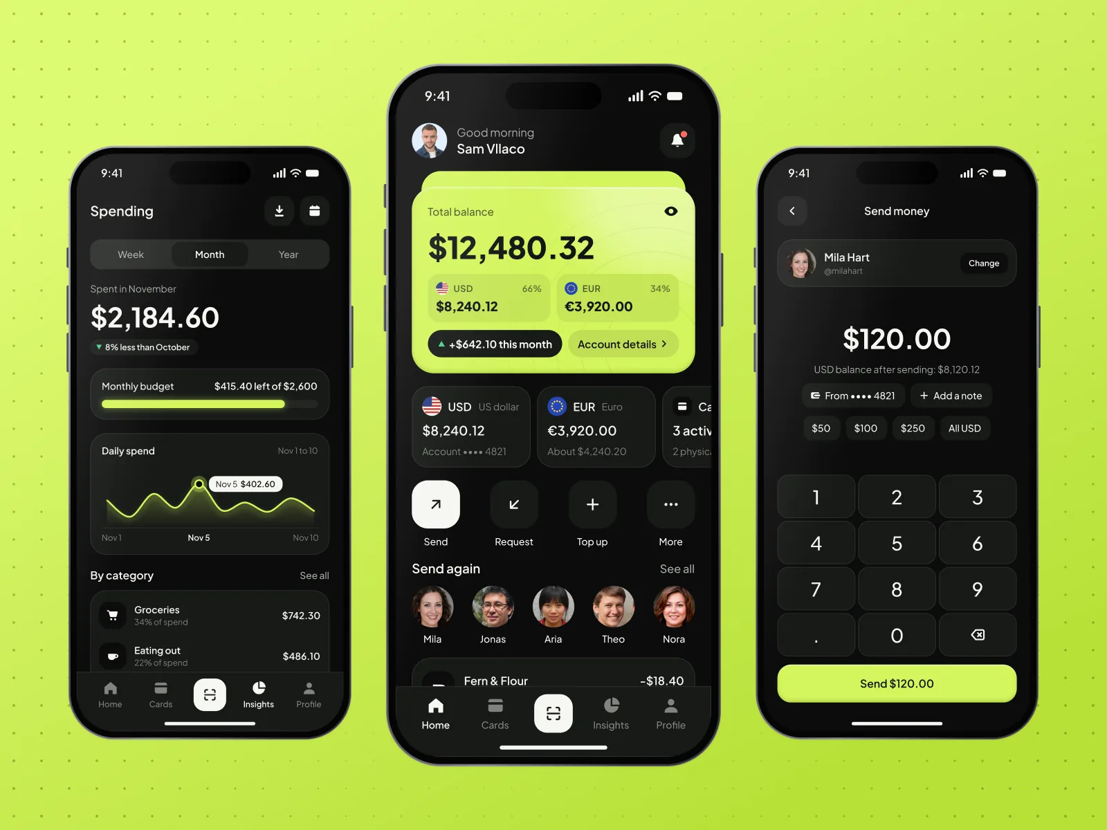
Orra is a concept for a mobile banking app with accounts in more than one currency. Home answers the first question, how much do I have, with one balance card. Spending shows where the money went this month, and sending money is a number pad with quick amounts.
The total sits in the largest card, with each currency under it.
The month is shown against the budget you set, not as a bare chart.
Recent people, quick amounts and a clear total before you confirm.
Available for new projects
Book a 30 minute product strategy call. We map the scope, the timeline and the one next step.